Graphic design is constantly evolving, shaping the way brands connect with their audiences. Whether it’s logo design, ads, content creation, or social media, keeping up with design trends can help your brand stand out. Here are a few Graphic Design Trends we have been seeing lately and think you should know!
Bold Minimalism
Bold Minimalism is just what you could expect, simple designs made to stand out. In our fast-paced world, people don’t always have time to stop and dissect intricate details in a design. That’s where bold minimalism comes in.
This trend uses strong shapes, bold typography, and a simple but striking color palette. It catches the eye quickly and allows for personal interpretation. It’s a perfect balance of restraint and power—allowing brands to communicate their identity with clarity and confidence. Designers who use this style focus on clear designs, strong contrasts, and bold messages. They aim to impress without adding extra clutter.
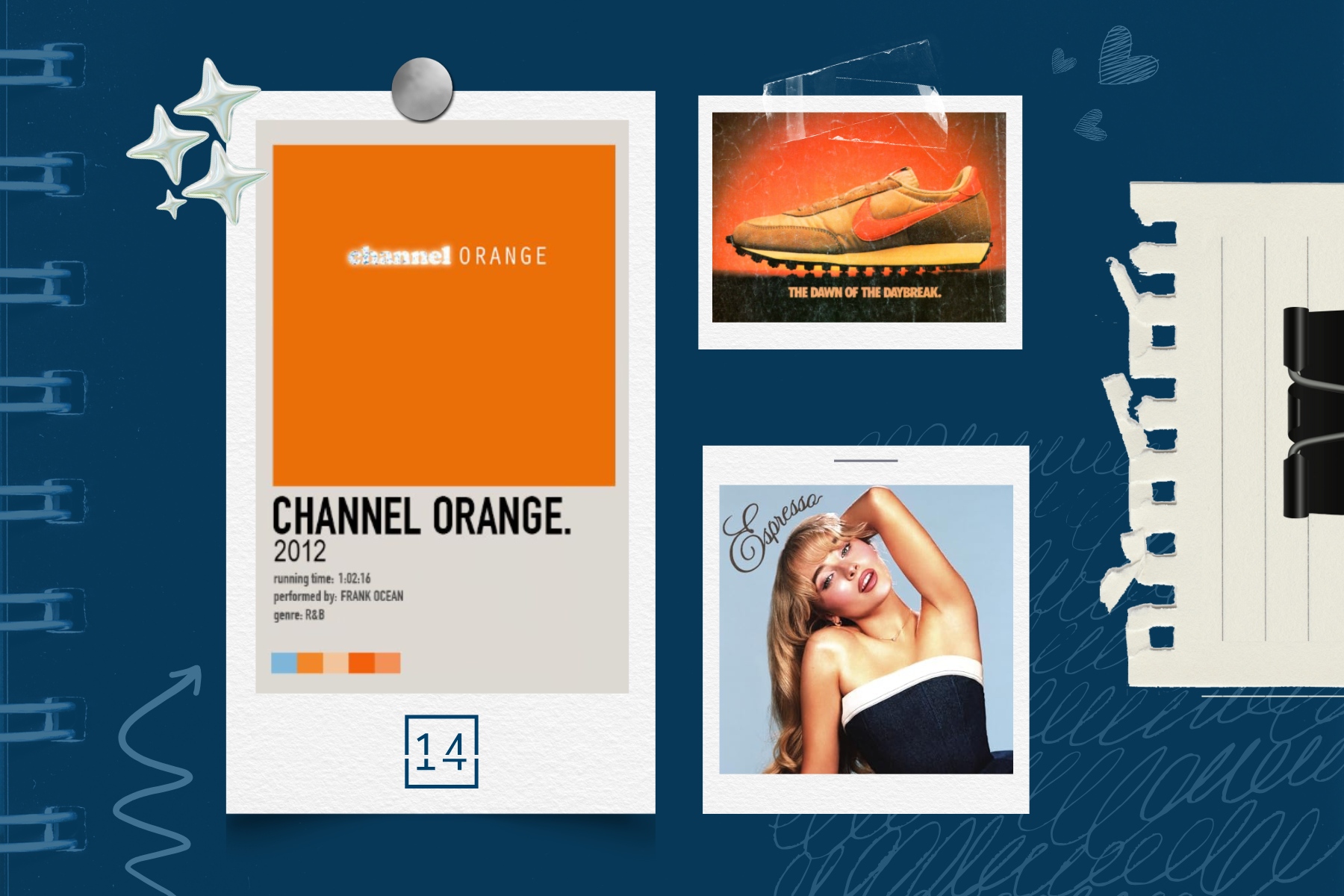
Example: Frank Ocean’s Channel Orange album cover—a single, bold color with simple typography that remains instantly recognizable.
Textured Grains
For years, digital design leaned toward pristine, hyper-polished aesthetics. But now, textured grains are making their mark by adding a raw, organic feel to designs.
Think of it this way—perfection can feel sterile. Textured designs bring character, warmth, and authenticity to visuals by incorporating grainy overlays, distressed edges, and subtle imperfections. Much like how an old film photograph has a certain charm, adding these textures to designs creates a nostalgic and tactile experience.
As humans, we love polished aesthetics, but it’s our quirks and imperfections that make us unique. Design follows the same principle. A little grain, speckles in the background, or rough edges on typography can make a piece feel more approachable and real. Don’t be afraid to embrace the “happy mistakes” that make your design stand out.
Example: Nike’s “Vintage” series ads use grainy textures and faded colors. This gives them an old-school but modern feel.
Retro Serif Branding
Retro branding is back in style. One big part of this revival is the return of serif fonts. Once considered outdated in the digital age, serifs are now reclaiming their space as a key player in branding, offering a mix of nostalgia and sophistication.
Brands are leaning into playful, curvy, and exaggerated serifs that resemble vintage advertisements from the ’60s, ’70s, and ’80s. This typography style evokes warmth and familiarity, making it an excellent choice for brands wanting to create an inviting and trustworthy feel.
We see this trend dominating music, fashion, and even food & beverage branding. Take Sabrina Carpenter’s “Espresso” single, for example. The retro serif font in her visuals ties into a playful, vintage-inspired aesthetic, helping her brand transcend just music and seep into culture, fashion, and marketing. This led to collaborations with Dunkin’, where even their advertisements and drink packaging borrowed from this throwback design.
Other industries are doing the same. Beauty brands, coffee shops, and tech companies use thick, high-contrast serifs. This helps connect modern innovation with timeless appeal.
Examples: Sabrina Carpenter’s “Espresso” branding, Gucci Beauty’s vintage-inspired serif fonts, and Dunkin’s retro marketing campaign.
AI-Driven Customization
Artificial Intelligence is no longer a futuristic concept—it’s actively shaping how brands design for consumers. AI-driven customization allows brands to create hyper-personalized content in real time, responding to user behavior, preferences, and even emotions.
This trend includes AI-generated artwork and real-time branding updates. It focuses on making design flexible and personalized for each user. We’re seeing AI assist in logo adaptations, social media visuals, and even website design where elements shift based on user interactions.
Think of Spotify Wrapped—it’s a customized visual experience designed uniquely for every user. AI-driven designs help brands create more engaging and meaningful interactions while making consumers feel seen and valued.
Example: Spotify Wrapped has fun animations just for you. Adobe Sensei offers AI tools to help with design. Netflix changes its cover art to fit different viewers.
Dark Mode Everything
Dark mode isn’t just a UI setting—it’s now influencing graphic design trends across the board. With more platforms embracing dark-themed aesthetics, designers are adapting their visuals to suit this high-contrast, moody style.
Dark mode-friendly designs often use neon accents, glowing typography, and bold gradients that pop against deep backgrounds. This trend isn’t just about aesthetics—it’s also about accessibility, reducing eye strain, and giving digital experiences a sleek, premium feel.
From web design and branding to social media graphics, dark mode aesthetics make visuals appear sophisticated, immersive, and modern. It’s especially dominant in tech, gaming, and futuristic branding, but even lifestyle and fashion brands are experimenting with monochrome palettes and striking neon contrasts.
Example: Apple’s macOS has a dark mode. Spotify uses a dark interface with bright neon album covers. Gaming brands like Razer add glowing green accents on black backgrounds.
Final Thoughts
Graphic design is constantly evolving, but the trends that stand out in 2024 are bold, nostalgic, textural, and dynamic. Great design can be simple and bold. It can also be warm with textured grains. Using AI helps create personalized designs. The main point is this: good design tells a story and creates an experience.
If you’re a brand looking to refresh your visuals, consider tapping into one of these trends to stand out in today’s ever-changing digital landscape.
Read More:
We’re Not Industry-Specific—We’re People-Specific
Top 3 Sports Marketing Trends to Watch in 2025
Unlocking the Superstitions: What Friday the 13th Can Teach Us About Marketing


Written by: Gabby Bordonaro (Client Relations Coordinator) & Brooke Morawiec (Graphic & Web Designer)